

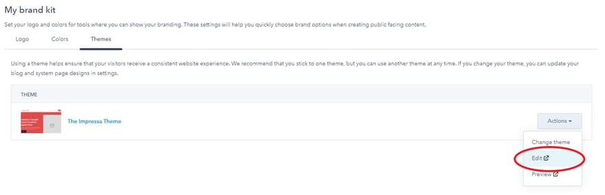
There are a few ways to edit/view your theme settings. If you just came from getting the Impressa theme from Marketplace, you can edit the theme under the Themes tab of your brand kit. To do so, just click on Edit under the Actions dropdown.
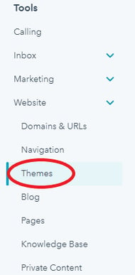
 Another way you can edit your theme settings is in your HubSpot Settings, under the Website Dropdown.
- Click the Website Dropdown and then choose the Themes option
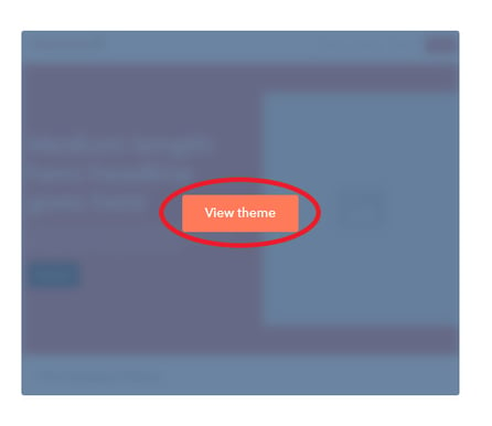
- Then, hover over the Impressa Theme thumbnail and click the View theme button.
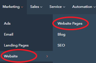
Finally, the last way you can view/edit your theme is when you create or update a page for your website.
- On the Hubspot Navigation bar, click the Marketing dropdown then select Website. Then select Website pages.
- Then, click on the create button, and choose either a Website page or a Landing page.
- Select one of the Impressa Theme page templates. A page editor will open up in which you will see on the left a menu. Click on the Theme tab.

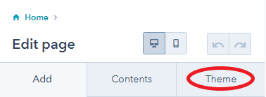
- In the theme tab, click the Edit theme settings
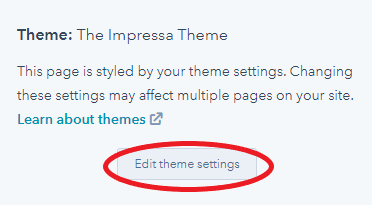
Great! Now you have gotten to the theme settings! Here you can change the styling of the following assets.
Theme Setting Options
- Global colors
- Primary Text – This is the text color for a majority of the template
- Light Text – This is the text color that goes with any section with a Secondary Background
- Primary Background – This is the primary background color of the sections for a majority of the template
- Secondary Background – This is the secondary background color applied to several pre-made sections. This color will also apply to a majority of the buttons
- Grey Background – This is another background color option applied to several pre-made sections. However, if your primary color is white, you should make this color a grey color.
- Tertiary Background – This is the color of the secondary button {which is mostly displayed on forms) and the footer.
- Global fonts – Styling here will apply to all text
- Text – Font family applied here will change all of the paragraph or simple text.
- Headings – Font family applied here will change all the headings (H1-H6)
- Spacing – Styling here will apply to all sections
- Vertical spacing – This is the spacing on the top and bottom of all sections in desktop view.
- Maximum content width – This is the size of the containers that hold all of the content of each section.
- Text – Styling here will be applied to all headings and body text.
- Heading one
- Font
- Font Size – needs to be in REM for responsive styling.
- Font Color - Inherits primary text color
- Font Weight
- Underline Option
- Transform
- Heading two
- Font
- Font Size– needs to be in REM for responsive styling.
- Font Color - Inherits primary text color
- Font Weight
- Underline Option
- Transform
- Heading three
- Font
- Font Size– needs to be in REM for responsive styling.
- Font Color - Inherits primary text color
- Font Weight
- Underline Option
- Transform
- Heading four
- Font
- Font Size– needs to be in REM for responsive styling.
- Font Color - Inherits primary text color
- Font Weight
- Underline Option
- Transform
- Heading five
- Font
- Font Size– needs to be in REM for responsive styling.
- Font Color - Inherits primary text color
- Font Weight
- Underline Option
- Transform
- Heading six
- Font
- Font Size– needs to be in REM for responsive styling.
- Font Color - Inherits primary text color
- Font Weight
- Underline Option
- Transform
- Body
- Font
- Font Size– needs to be in px, as this sets the root style size for Headings.
- Font Color
- Links
- Font
- Font Color - Inherits primary text color
- Font Weight
- Hover
- Color - this changes the color of links when you are hovering over them.
- Heading one
RECCOMENDED TEXT STYLING
It is highly recommended that you do not change the styling of the headings unless you need to change the font size or weight. (If you change the font sizes, ensure that all headings are in REM and the body is in px. Setting the body to a higher px size will also increase the size of your headings, as changing the body sets the size of your root.
Applying multiple changes to all of the options will make the website too hectic for regular viewing and may also cause some issues with responsiveness. Change at your own risk.
- Buttons – Styling here will apply to all buttons, with the exception of the color of secondary buttons.
- Text
- Font
- Font Size
- Font Color - Inherits light text color
- Font Weight
- Underline Option
- Transform
- Background
- Color – Inherits Secondary Background Color
- Opacity
- Border
- Style
- Color - Inherits Secondary Background Color
- Opacity
- Width
- Corner
- Radius
- Spacing
- Padding
- Hover
- Font - can apply changes to button font when hovering
- Background - can apply changes to the background of button when hovering. Inherits tertiary color
- Border - can apply changes to border of button when hovering. Inherits tertiary color.
- Text
RECCOMENDED BUTTON STYLING
It is highly recommended that you follow these rules with applying styling to your buttons.
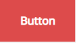
The text of your button needs to be highly legible. So if you have a dark red button, you should have a light colored text. If you have a light grey button, you should have a dark colored text. See the buttons below for examples. This method is to ensure that there is a proper contrast ratio. You can use this link to test if your colors will work! https://webaim.org/resources/contrastchecker/

It is also recommended that you follow certain rules when it comes to the padding of your button.

Overall, the padding on the right and left side should be the same. The padding on the top and bottom should be the same as well. THE PADDING ON THE RIGHT AND LEFT SIDE SHOULD BE LARGER THAN THE PADDING ON THE TOP AND BOTTOM.
-
- Form – Styling here will apply to Impressa Forms and Default Hubspot Forms
- Title
- Text
- Color – Inherits primary text color
- Background
- Color - is automatically transparent
- Text
- Labels
- Text
- Color - Inherits primary text color
- Text
- Help text
- Text
- Color - Inherits primary text color
- Text
- Fields
- Placeholder
- Color – Inherits primary text color
- Text
- Color - Inherits primary text color
- Background
- Color – Inherits primary background color
- Opacity
- Border
- Style
- Color
- Opacity
- Width
- Corner
- Radius
- Placeholder
- Border
- Style
- Color - is automatically transparent
- Width
- Button
- Text
- Font
- Font Size
- Font Color - Inherits light text color
- Font Weight
- Underline Option
- Transform
- Background
- Color – Inherits Tertiary Background Color
- Opacity
- Border
- Style
- Color - Inherits Tertiary Background Color
- Opacity
- Width
- Corner
- Radius
- Spacing
- Padding
- Hover
- Font - can apply changes to button font when hovering
- Background - can apply changes to the background of button when hovering. Inherits secondary color
- Border - can apply changes to border of button when hovering. Inherits secondary color.
- Text
- Background - this is the background color of the entire form. It is automatically transparent.
- Title
- Form – Styling here will apply to Impressa Forms and Default Hubspot Forms
RECCOMENDED FORM STYLING
It is highly recommended that you use the Impressa Theme module when adding forms. Not only will the stylings here be applied, but there will also be a shadow around the form, and the use of a special button that inherits the tertiary color and allows to be full width of the form.
- Tables
- Text
- Color - Inherits secondary text color
- Background
- Color - Inherits primary text color
- Text
- Color - Inherits primary text color
- Background
- Color - Inherits primary background color
- Text
- Color - Inherits secondary text color
- Background
- Color - Inherits primary text color
- Spacing
- Padding
- Border
- Style
- Color - Inherits primary text color
- Color Opacity
- Width
- Header
- Body
- Footer
- Cells
- Website header
- Text
- Color
- Drop downs
- Color
- Color – Inherits primary background color
- Opacity
- Style
- Color
- Opacity
- Width
- Text
- Background
- Border
- Color – Inherits primary background color
- Opacity
- Menu
- Background
- Website footer
- Color - Inherits secondary text color
- Color – Inherits tertiary background
- Opacity
- Text
- Background
RECCOMENDED HEADER/FOOTER STYLING

- Blog
- Text
- Color - Inherits primary text color
- Post Color - Inherits primary text color. This color is only applied to the text inside the post. Not on the listings.
- Background
- Color/Opacity – Inherits primary background
- Post Background Color - Inherits primary background. This color is only applied to the background inside the post. Not on the listings. If you want to change the listings background color, you do so in the module itself.
- Related Post Background Color - inherits primary background. This color is applied to the cards of the related posts in every individual blog post.
- Text
RECCOMENDED BLOG STYLING


Want to make a comment?